
I'm in the midst of gathering gallery names to send my portfolio to in the next month. As I leaf through the potentials I can't help but get frustrated that everything is the same. There are definitely some ceramics galleries that show the range of work out there. However the trends are hard to ignore. I have already been shot down from some sites because my work doesn't fit the aesthetic. Its frustrating when the quality of the product is there but "the look" doesn't fit. Right now everything is white and stark with the occasional contrast of color. There are some artists who just naturally have that aesthetic while others are just shamelessly knocking off that style. After all, style should be individual, right?!
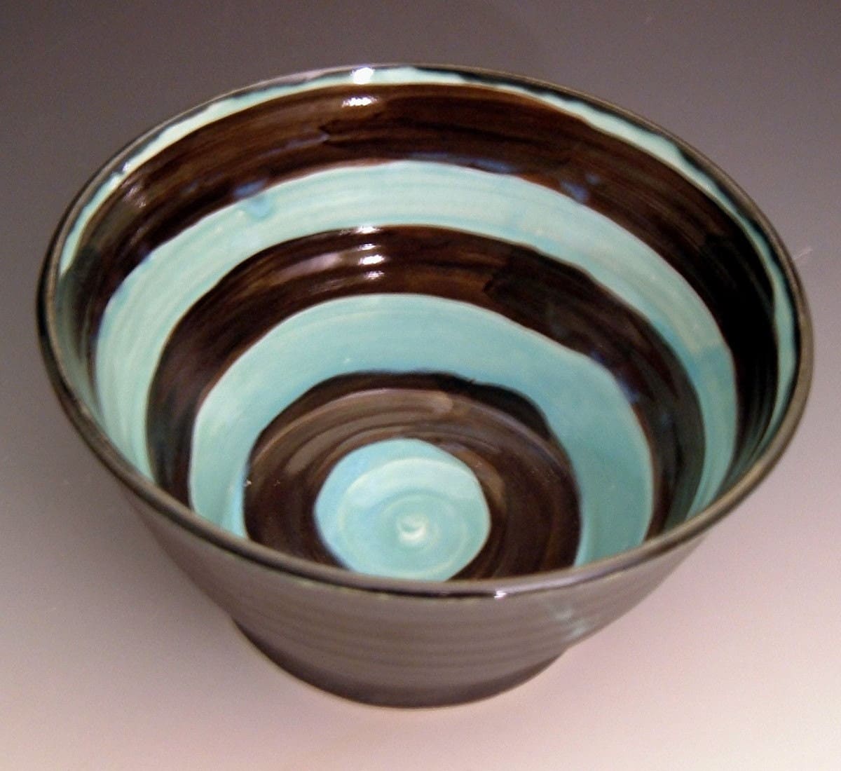
My work is the opposite of the white on white look. Its not shabby chic, modern or sculptural. Its black. Very, very dark. With pops of color and cherry blossoms or stripes. Nothing subtle about it. Its a direct reaction to my landscape. In Cleveland we have little sunshine. The skies are gray with lots of rain and snow. But when the sun is out its beautiful and green. We also have a contrast of many green spaces in the suburbs with a skyline of downtown and industrial settings throughout. The landscape is definitely a huge influence in my work.
Now the question is when I send out these portfolios will people get it? And if they do will they be open minded that my work does sell because of the color palette. I can't keep anything with cherry blossoms in stock. Its my current project to churn out as much as I can in anticipation for this year's shows. I'll keep you posted...
No comments:
Post a Comment